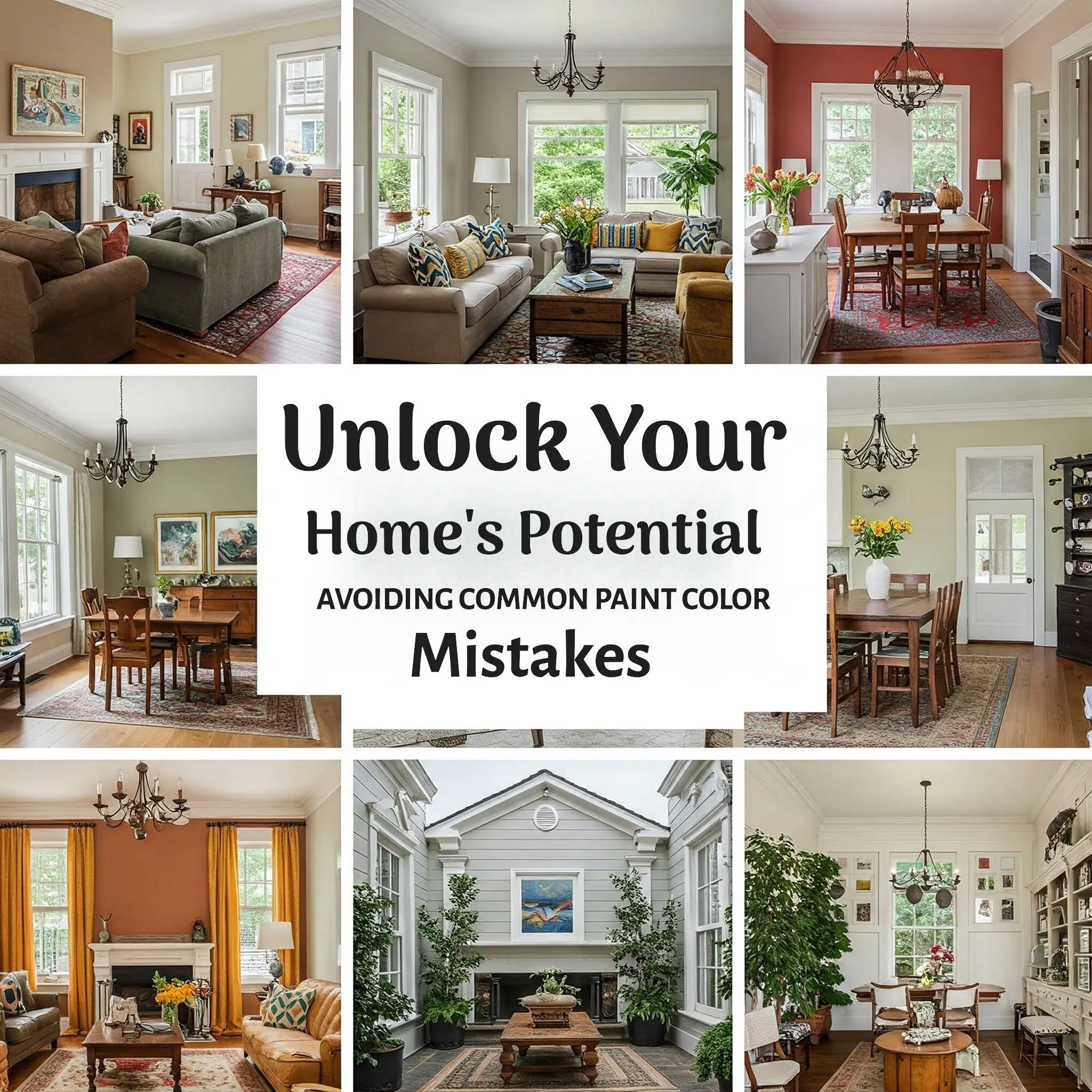

Unlock Your Home's Potential: Avoiding Common Paint Color Mistakes
"Please be advised that we may receive compensation from the products featured on this page, and we participate in affiliate programs. Learn More ›"
Ever walked into a room and felt instantly uplifted or remarkably serene? Chances are, the paint color played a significant role. The power of color to transform a space is undeniable, which is why the prospect of choosing the perfect hues for your own home can be both exciting and, let's face it, a little nerve-wracking. You might find yourself admiring the bold color choices in a magazine or a friend's house, thinking, "I want to bring that vibrancy into my own space!" But then comes the moment of truth: standing before an overwhelming wall of paint chips at the store, feeling utterly paralyzed by the sheer number of options.
This hesitation is completely understandable. Selecting the right paint colors involves navigating a maze of considerations, from understanding different undertones to coordinating with existing furniture and textiles. Before you even think about picking up a brush, it's wise to take a step back and cultivate some inspiration. Dive into the pages of your favorite home decor magazines, save images that resonate with you on platforms like Pinterest or Houzz, and create a mood board – either physical or digital – that you can revisit at your leisure. As you review your collected inspiration, start to define the feeling you want each room to evoke. Should your living room be a cozy haven for relaxation? Or do you envision your kitchen as an energetic hub for family gatherings? The recurring themes and colors in your inspiration will serve as a valuable foundation for developing your home's color palette. To further guide you on your color journey, we've gathered insights from design experts on the most common paint color mistakes homeowners make, so you can learn from their experiences and achieve a beautifully painted home.
====================================================================
The Pitfalls of Following Fleeting Trends in Home Color
The allure of the latest color trends can be strong. When a particular shade dominates fashion runways and product designs, it's easy to feel compelled to incorporate it into your home. However, the colors you choose to live with day in and day out should be a reflection of your personal taste and preferences, not just a passing fad. While embracing current trends might seem like a way to keep your home looking stylish, these trends can quickly become outdated, leaving you with a color scheme you no longer love. Instead of committing to an entire room painted in the "it" color of the moment, consider using trendy hues in smaller, less permanent ways. Think decorative throw pillows, accent fabrics, artwork, or even smaller painted elements like a feature wall or the inside of shelving units. This approach allows you to enjoy the current styles without making a long-term commitment that you might later regret. Remember, your home should be a sanctuary that reflects your enduring style, not a showcase of fleeting trends.
====================================================================
Prioritizing Existing Furnishings Over Wall Color Selection
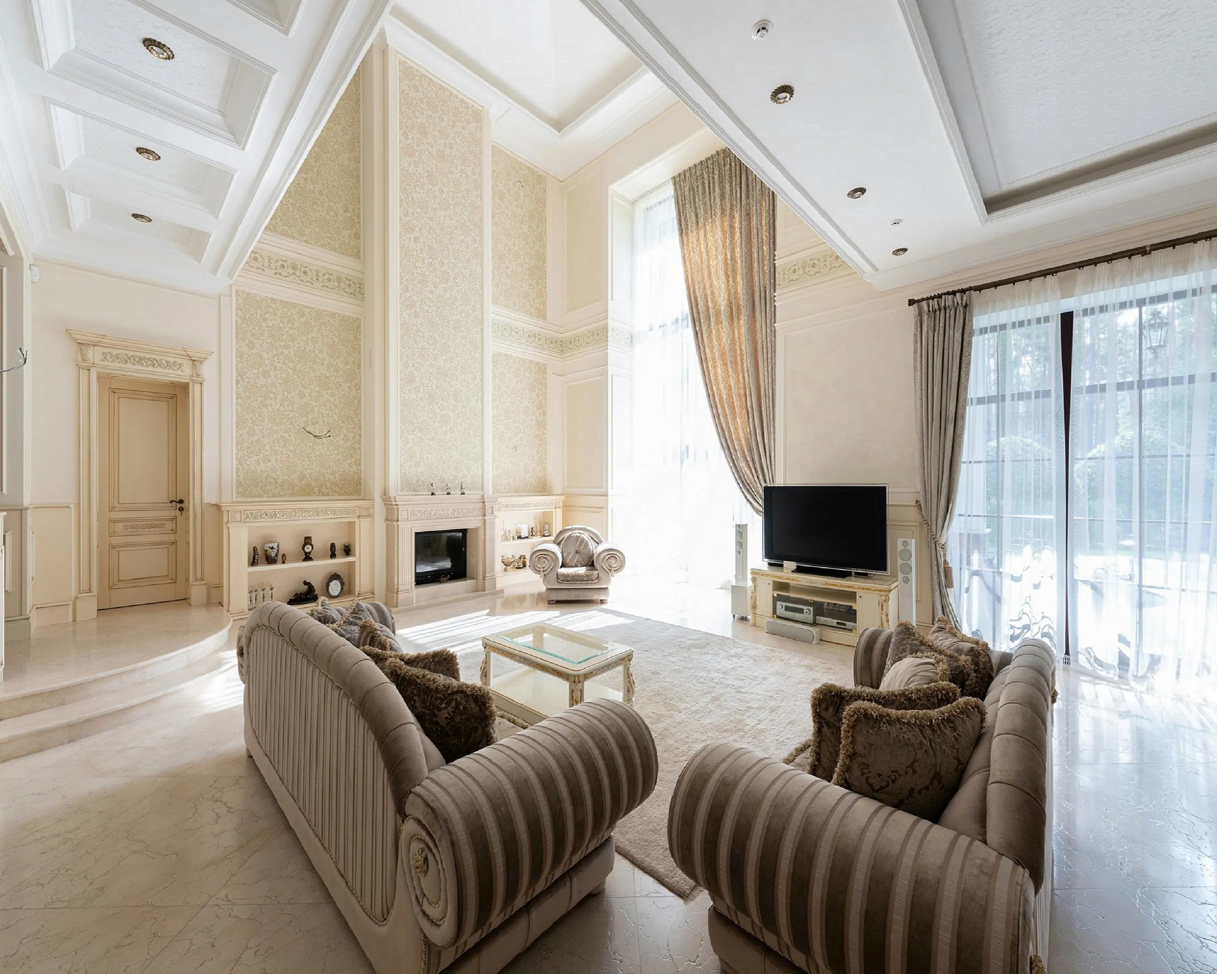
A common misstep many homeowners make is painting their walls first and then attempting to find furniture and fabrics that coordinate with the newly painted color. This approach often leads to frustration and limited choices. The more logical and efficient way to approach interior design is to first consider the items that will occupy the room, such as your area rugs, sofas, and key pieces of furniture. These items often represent a significant investment and have a more limited range of color options compared to paint. Once you have your foundational pieces in place, you can then select a paint color that complements and harmonizes with their existing color palette. This ensures a cohesive and well-integrated look for your space. Think of your walls as a backdrop that should enhance and support the other elements in the room, rather than dictating them. By starting with your furnishings, you'll have a much easier time finding a paint color that ties everything together beautifully.
====================================================================
The Critical Role of Lighting in Paint Color Perception
Have you ever fallen in love with a paint color in the store, only to find it looks completely different once you've applied it to your walls at home? This discrepancy is often due to the significant impact of lighting. Colors can appear dramatically different under bright sunlight compared to the warm glow of artificial lighting in the evening. Before committing to painting an entire room, it's absolutely crucial to test your chosen color in the actual space. Purchase a sample pot of your top contenders and paint large swatches on different walls. Live with these swatches for a few days, observing how the color changes throughout the day and under various lighting conditions. Pay attention to how it looks in natural daylight, under artificial light in the evening, and even in the shadows. This step will prevent costly mistakes and ensure you're truly happy with your final color choice, no matter the time of day.
====================================================================
Beyond Basic White: Exploring the Spectrum of Neutral Hues
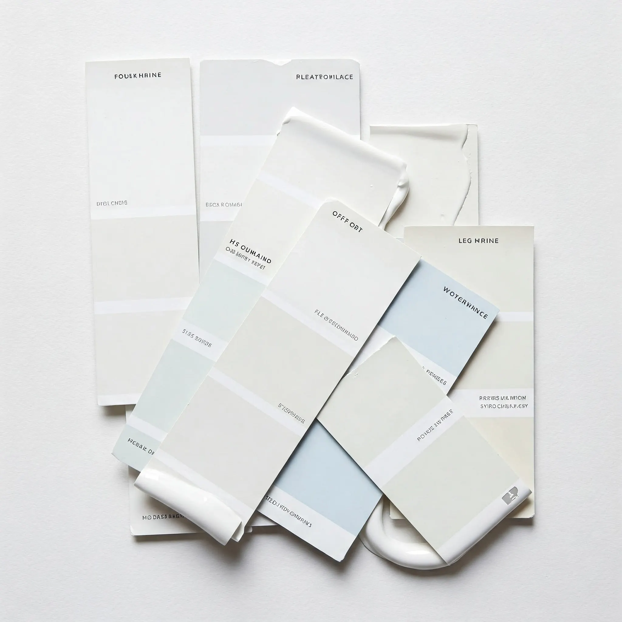 When homeowners are looking to introduce color into their homes, they sometimes overlook white paint, assuming their options are limited to stark, pure white or a basic creamy off-white. However, the world of white paint has evolved significantly. Today, what we consider "white" encompasses a vast range of shades that incorporate subtle undertones of lavender, green, blue, and gray. These nuanced whites can add depth and sophistication to a room without feeling overly colorful. If you're drawn to the idea of a light and airy space but want something with a bit more character than a standard white, explore the extensive spectrum of off-whites and light neutrals. You might be surprised by the subtle yet impactful difference these shades can make in creating the desired mood and atmosphere in your home.
====================================================================
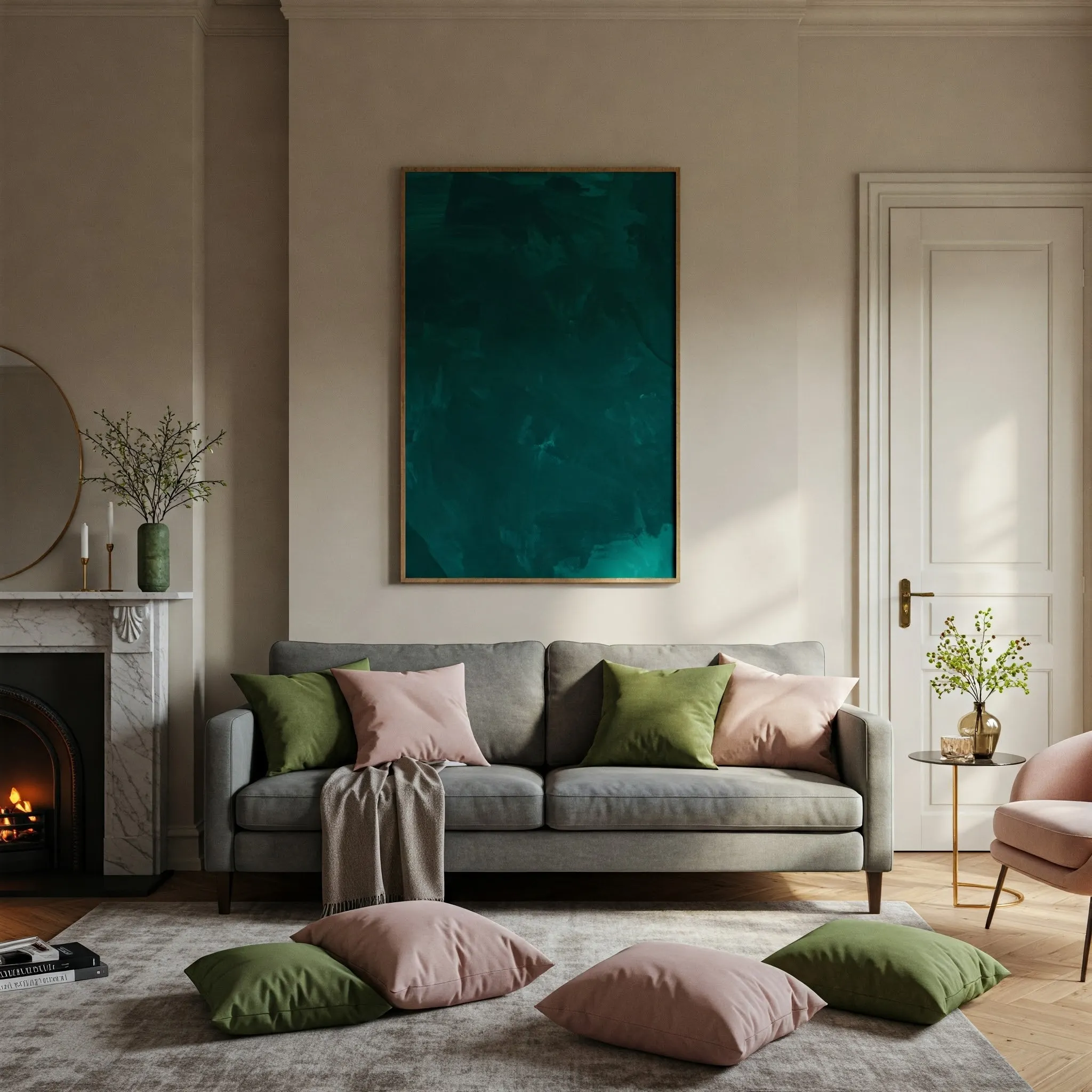
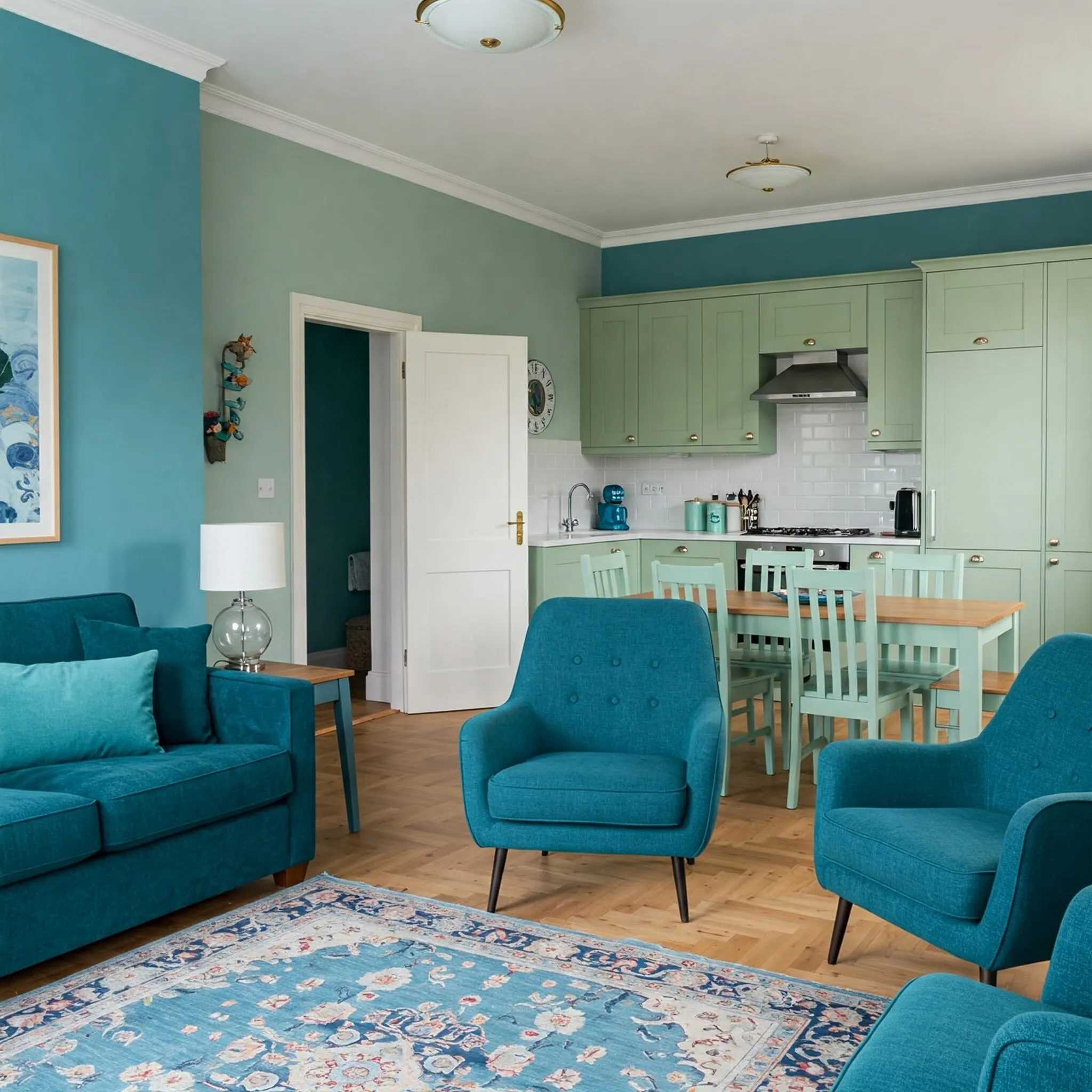
Creating Harmony: Balancing Dominant and Accent Colors
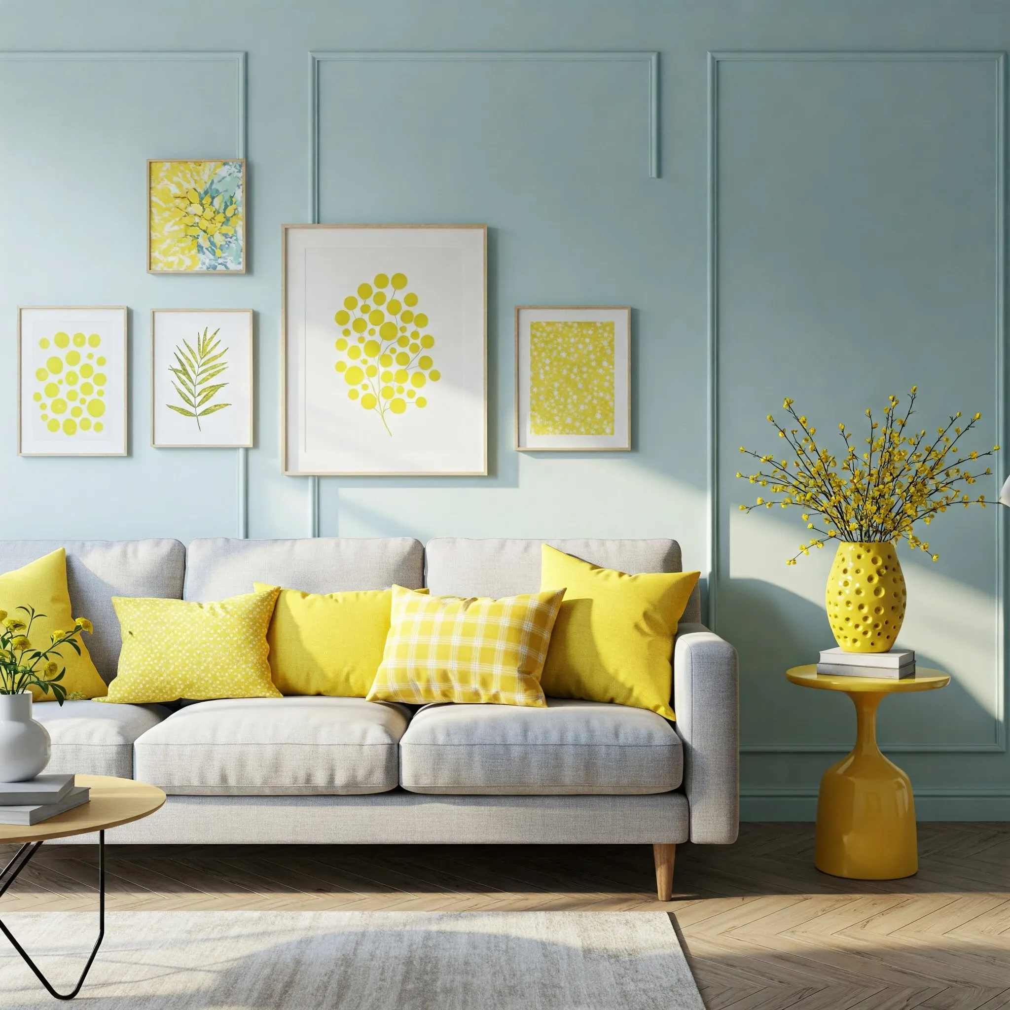
When working with a two-color scheme, it's important to understand the concept of balance. Avoid using equal amounts of both hues in a space, as this can create a sense of visual competition rather than harmony. Instead, aim for one color to be the dominant force in the room, taking up the majority of the visual space, while the other serves as an accent color, providing pops of interest and contrast. For example, you might choose a calming blue for your walls and then introduce vibrant yellow accents through throw pillows, artwork, or decorative accessories. This approach creates a more visually appealing and balanced space, allowing each color to play its intended role effectively. Remember, the goal is to create a cohesive and inviting atmosphere, not a battle of the hues.
====================================================================
Don't Forget the Fifth Wall: The Impact of Ceiling Color
Often overlooked in the color selection process, the ceiling represents a significant expanse of space – essentially the "fifth wall" of a room. Ignoring the ceiling's potential can be a missed opportunity to enhance the overall aesthetic of your space. To maximize its impact, consider different approaches to ceiling color. A pale shade that complements the wall color can create a sense of spaciousness and continuity. A high-gloss white can reflect light and make the room feel brighter. For a more dramatic effect, you could even choose a bold hue that acts as the room's main source of color, particularly in spaces with high ceilings. The key is to consider the ceiling as an integral part of your room's overall color palette and choose a color that contributes to the desired mood and style.
====================================================================
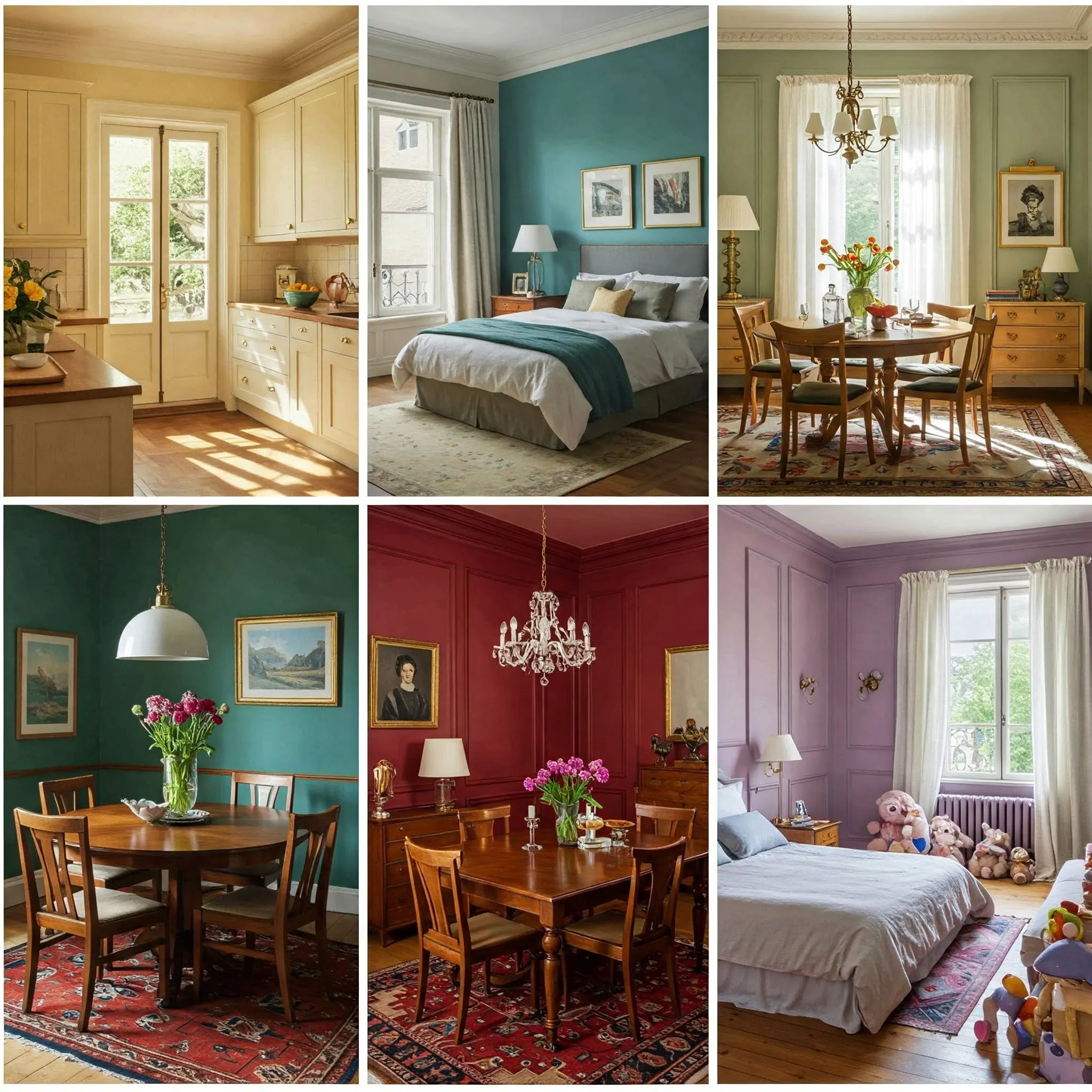
The Importance of a Cohesive Color Flow Throughout Your Home
When selecting paint colors for multiple rooms, especially those that are visible from one to another, it's crucial to consider the overall flow and cohesion of your home's color palette. Choosing individual favorite shades for each room without considering how they relate to each other can result in a disjointed and visually jarring experience. For a more harmonious and unified look, plan ahead and select shades that are close together on the color spectrum, such as a progression of yellows, greens, and blues. You can also achieve cohesion by using variations of the same color in different rooms, such as a light beige in the hallway, a slightly darker beige in the living room, and a rich tan in the dining room. This creates a sense of continuity and allows your eye to move smoothly from one space to the next, enhancing the overall feeling of spaciousness and flow in your home.
====================================================================
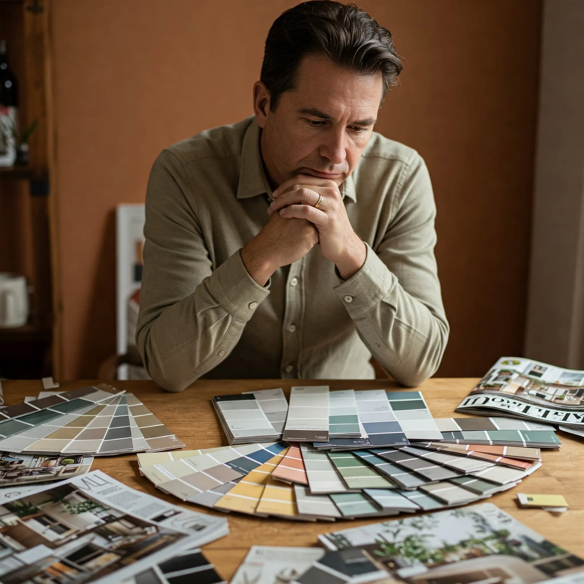
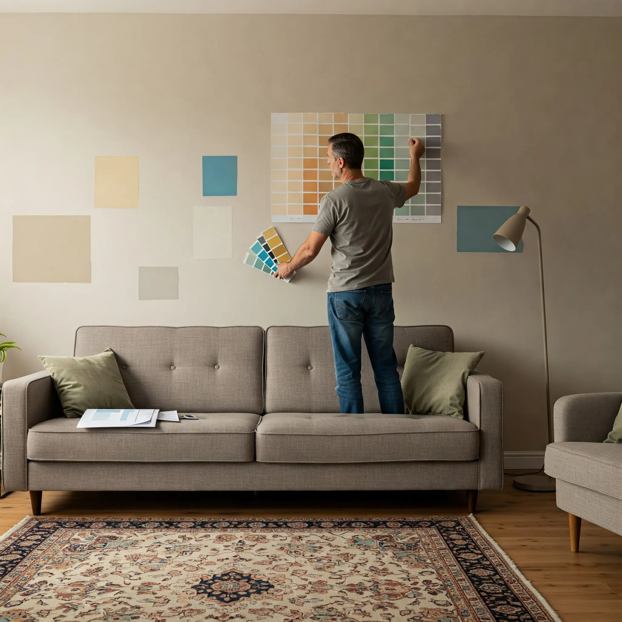
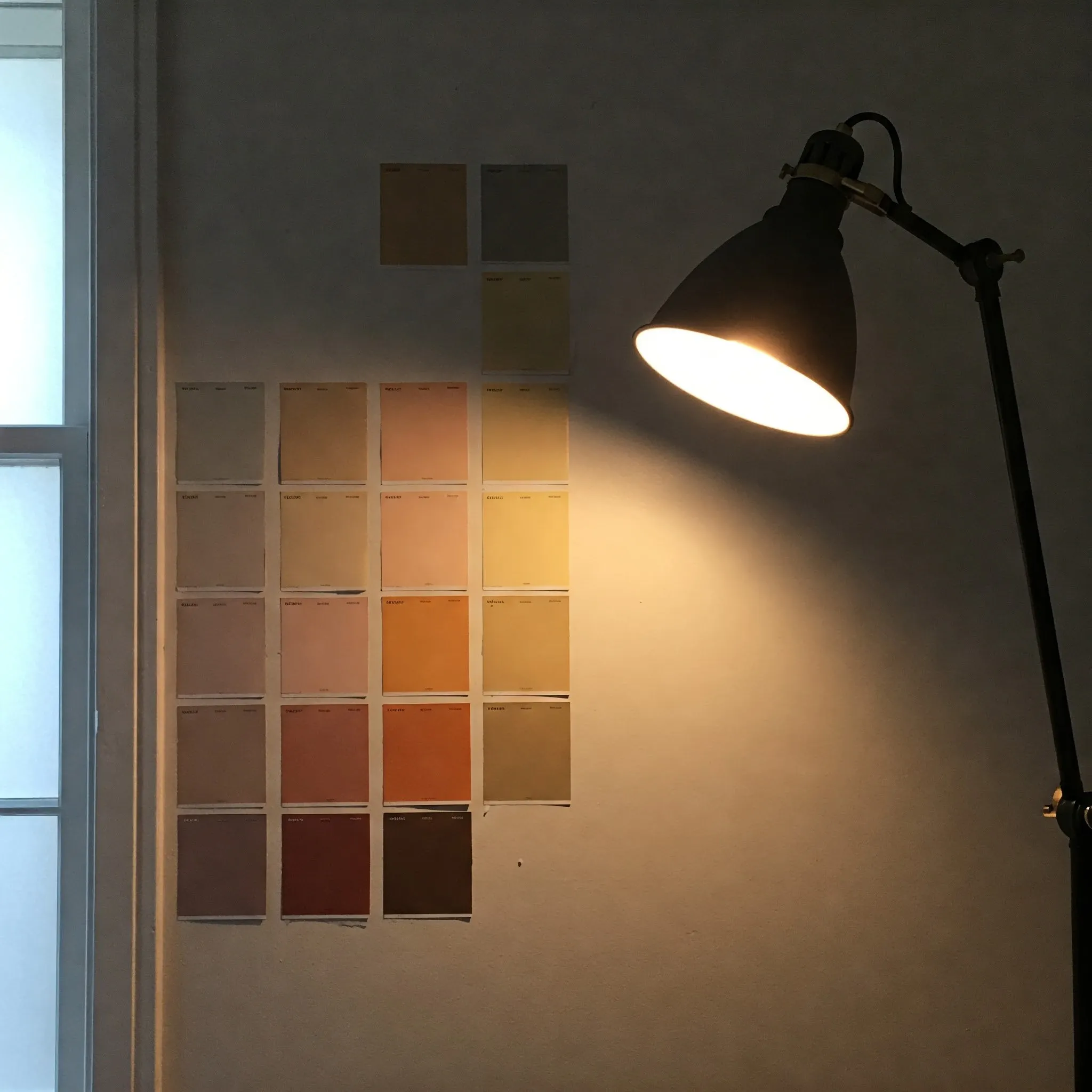
The Power of Comparison: Narrowing Down Your Color Choices
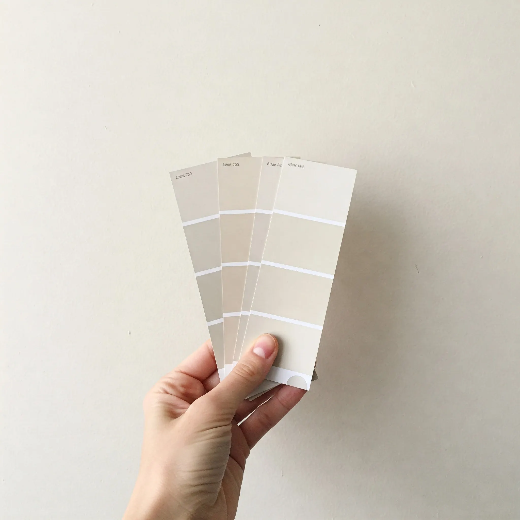
When faced with a multitude of similar paint chips, it can be challenging to discern the subtle differences between them. A helpful technique for making the right choice is to compare multiple values of the same tone. Select five to seven swatches that appear similar and then evaluate them side-by-side under different lighting conditions throughout the day. Eliminate the shades that don't quite hit the mark, gradually narrowing down your options until you have your top two contenders. Even between these final two, you'll likely notice slight variations in their undertones and how they appear at different times of the day. If you're still unsure, purchase sample pots of both and paint larger swatches to observe them in your space before making your final decision. This process of careful comparison will significantly increase your chances of selecting the perfect paint color.
====================================================================
Beyond a Single Shade: Embracing the Monochromatic Scheme
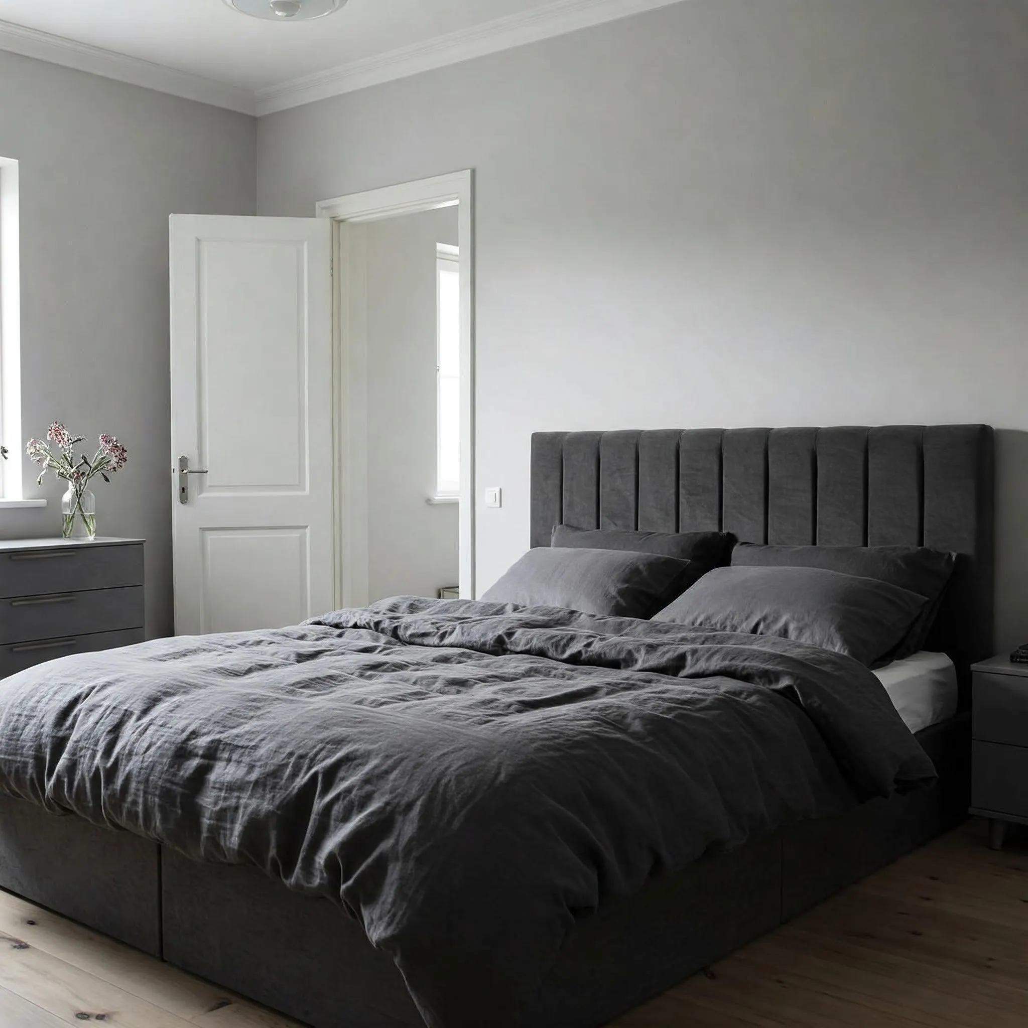
So, you've found a color you absolutely love. While it might be tempting to simply apply that single shade to all your walls, consider the added visual interest and depth you can achieve by exploring the color's family of shades and tints. Every hue available at the paint store comes with a range of variations, from lighter tints to darker shades. Pick up a few extra swatches that represent these variations and consider incorporating them on different surfaces within the room. For example, you could use the main color on the walls, a lighter tint on the ceiling, and a darker shade on the trim or even on furniture pieces. This monochromatic scheme creates a sophisticated and cohesive look while adding subtle contrast and visual intrigue to your space. Don't be afraid to experiment with different values of your favorite color to elevate your design.
====================================================================
Final Thoughts
Choosing the right paint colors for your home is a crucial step in creating a space you truly love. By being mindful of these common mistakes and taking a thoughtful approach to color selection, you can avoid costly errors and achieve a beautifully painted home that reflects your personal style and enhances your daily life. Remember to gather inspiration, prioritize your existing furnishings, consider the impact of lighting, and explore the full spectrum of color possibilities.
====================================================================
Key Takeaways
- Don't chase trends: Choose colors you love for the long term.
- Furnishings first: Select paint colors that complement your existing furniture and fabrics.
- Light matters: Test paint samples in your room under different lighting conditions.
- White is versatile: Explore the wide range of white and neutral shades.
- Balance your colors: Use one dominant color and another as an accent.
- Consider the ceiling: It's an integral part of your room's color scheme.
- Create a cohesive flow: Plan your color palette for multiple rooms to ensure harmony.
- Compare similar shades: Carefully evaluate different values of the same color.
- Explore monochromatic schemes: Use different shades and tints of your favorite color for added depth.
- Take your time: Don't rush the color selection process.
Popular Posts